OutOfOffice
Scope:
Discovery
Brand Strategy
UX
UI
Motion
Visual Identity
Enhancing outdoor adventure planning with a seamless rental experience
Background:
OutOfOffice is an innovative journey planning and equipment rental service for outdoor pursuits, providing a seamless way to prepare for trips. Our platform helps you plan with confidence, offering expert advice on the equipment and supplies needed for you and your vehicle. We ensure the gear is suitable and arrange delivery or fitting, so you're ready to go on time.
Objectives
Our core objective was to design a service that made outdoor pursuits accessible for everyone. We wanted to simplify the end-to-end process of hiring equipment and overcoming storage concerns for people, by implementing a modular-design and rental system for equipment specific to your needs.
By identifying key opportunity areas, our strategic recommendations foster impactful partnerships between OEMs, suppliers, and industry experts, driving effective brand collaborations. By working closely with trusted industry experts, we ensure supply of known and bespoke products that resonate with customers and enable us to build their trust. Together, we co-create memorable experiences.
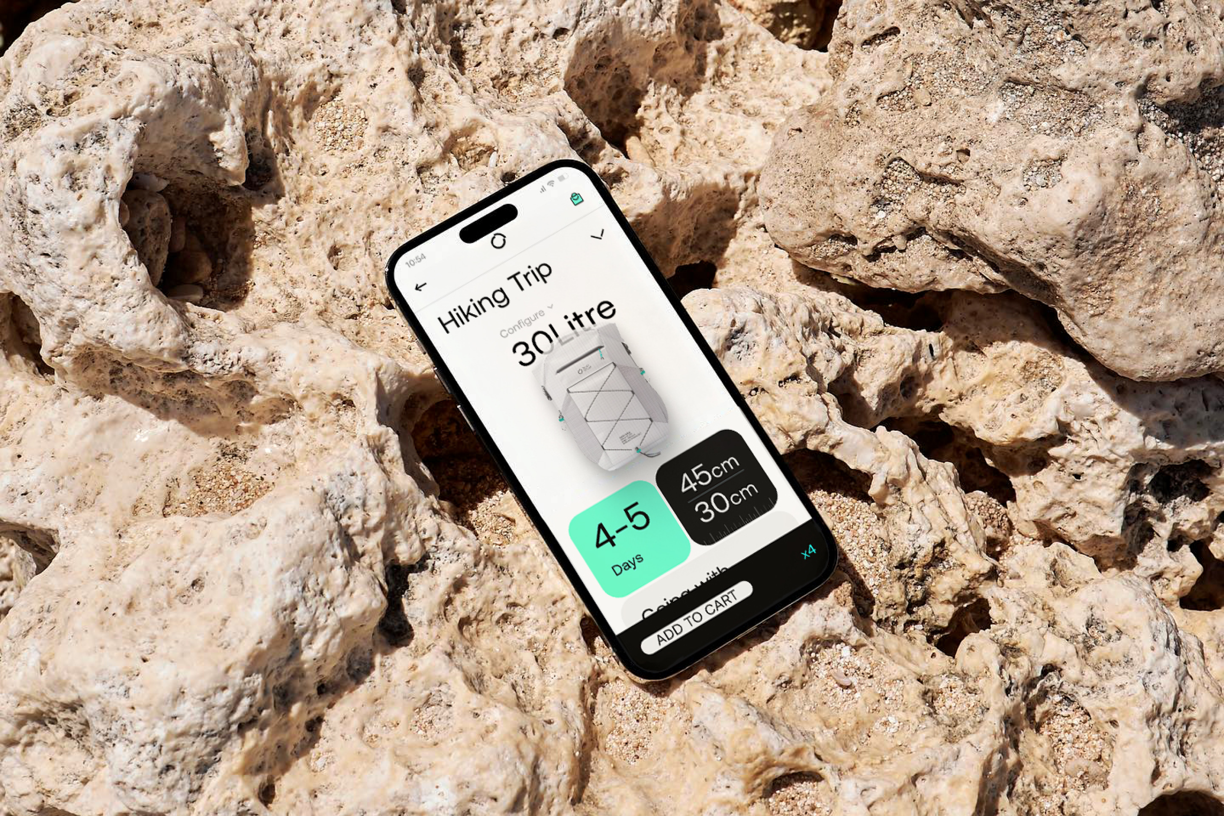


Brand Identity
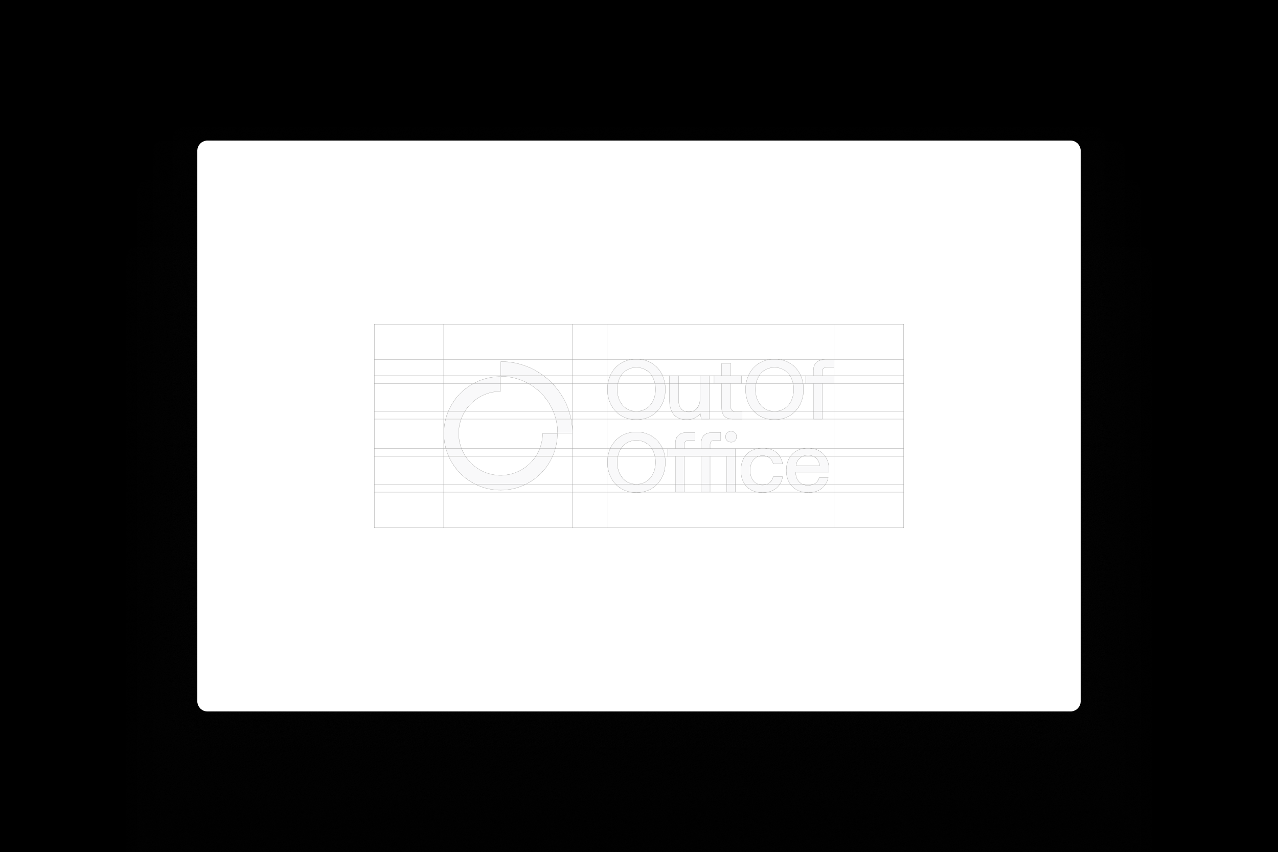
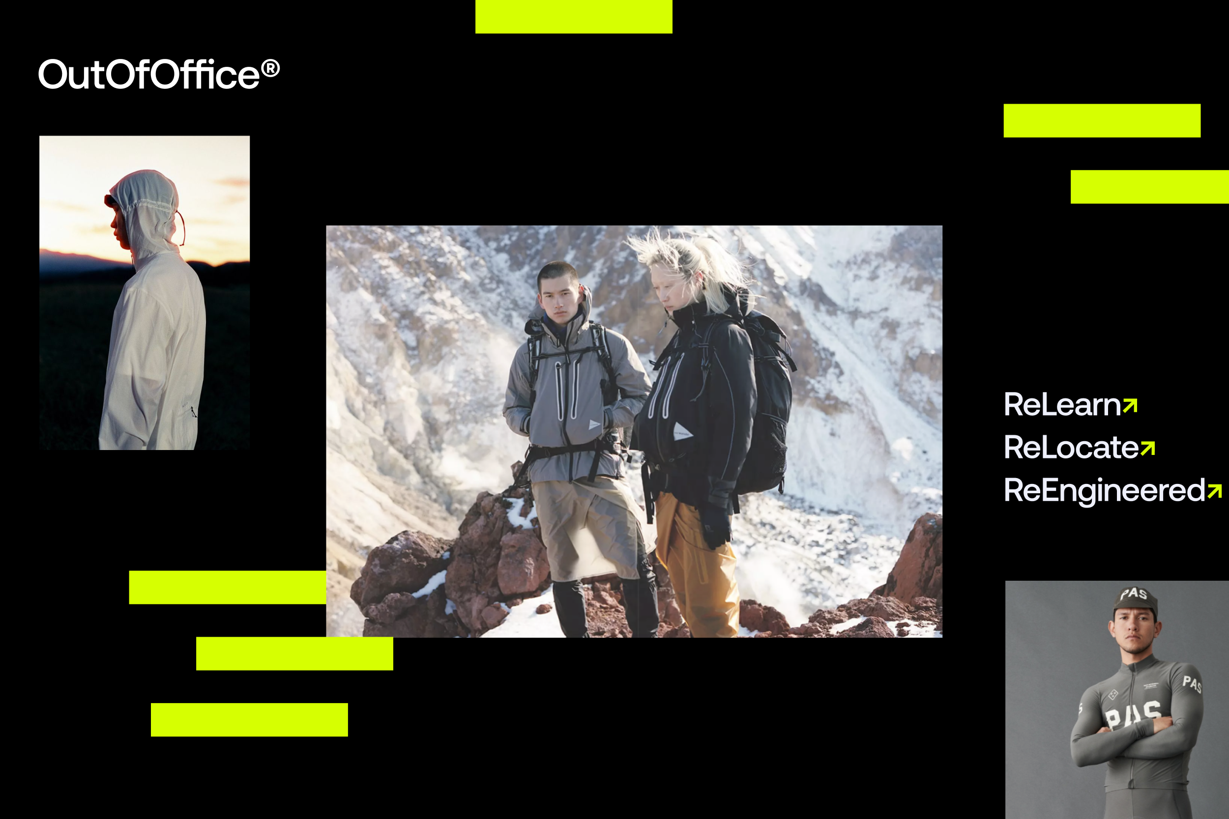
The OutOfOffice Brand Identity was created to symbolise modularity, movement and flexible solutions. Breaking out of the ‘routine’ to pursue passions we created a visual identify that symbolises modern utility.
The OOO design is based on a modular and functional system that provides flexible customisation and echoes the modularity of the OOO equipment and services.


Design Details
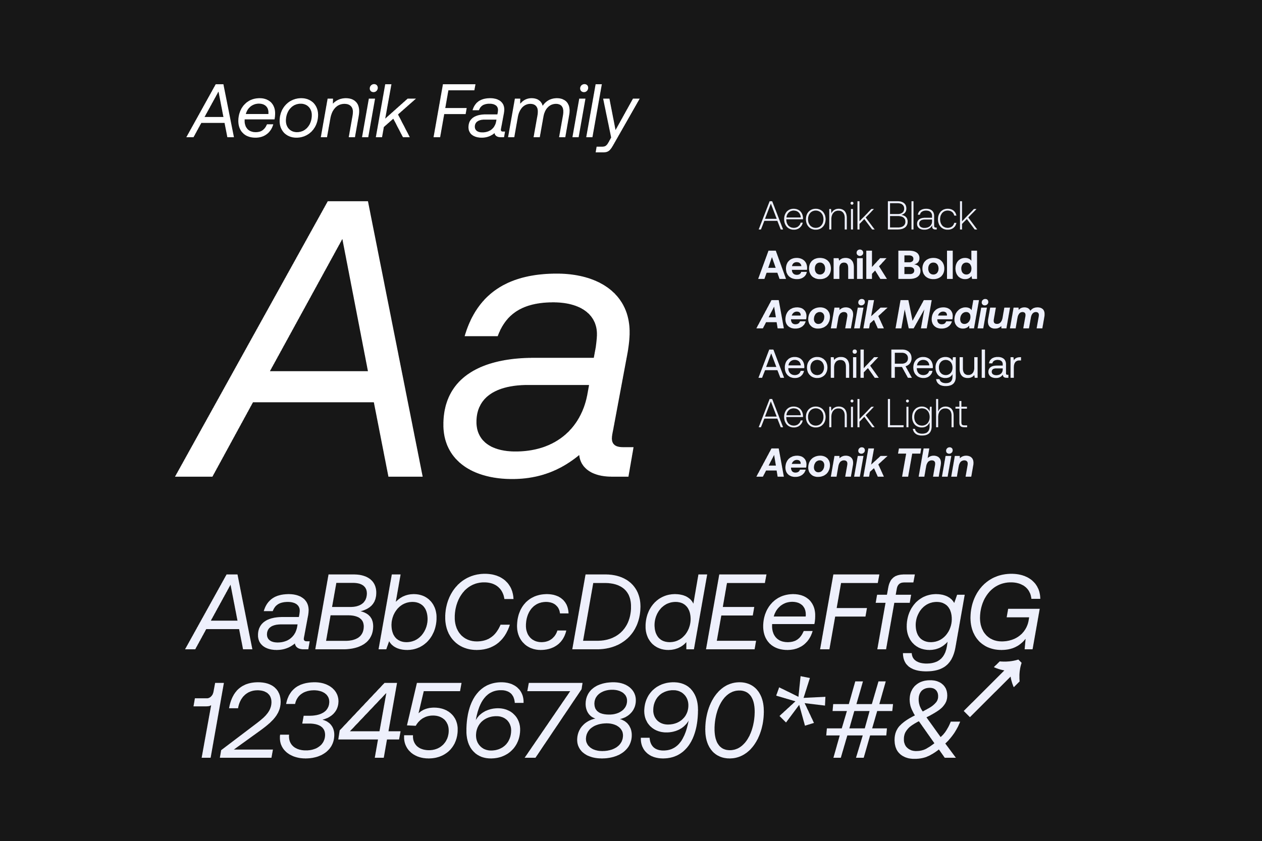
We chose the Aeonik typeface for its sophisticated and modernist qualities, drawing inspiration from early mechanical Grotesk fonts with their wider but balanced forms. Leveraging Aeonik’s versatility, we apply it to both interface and product design.
Our monochromatic colour scheme, complemented by subtle accents of colour, creates a clean and impactful aesthetic that ensures our products remain the focal point, tying into the modern utility aesthetic of the overall Brand Identity.

Capabilities
By combining a strong visual identity with a compelling concept for a white-label platform product, we were able to demonstrate how AFRY's capabilities and cross functional teams can deliver cohesive, high-value solutions valuable for clients in various sectors.
This approach not only highlights the versatility and scalability of the platform but also reinforces AFRY's ability to tailor innovative, end-to-end design solutions that meet client needs and drive business success.



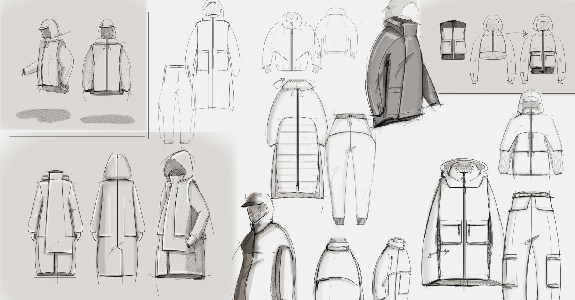
Outcomes
Currently we are in the process of leveraging key metrics such as scalability, user engagement, and time-to-market efficiency to demonstrate the value of our white-label platform to clients. By showcasing its adaptability across industries and measurable ROI, we have successfully partnered with our first OEM, collaboratively tailoring the platform to their specific needs. This milestone highlights the platform’s potential to drive innovation and streamline operations for future clients.


Project Details -
Company:
AFRY Experience Studios
Year:
2023-2024
Role:
Design Director
Project:
Brand Identity, Strategy & Storytelling
The Role
Head of Design:
Rob Dolton
Design Team:
James Gimlett-Taylor
Oliver Niblett
Industrial & Product Design:
Ruben Eriksson
Irene Chiu
UX:
Ben Guyer
Team


